TRISHA
IYER
NBCU News Group Projects
I worked for NBCU News Group during the 2023-2024 academic year, spanning 8 months. I participated as a UX designer for many projects including the the Nebula editorial design systems, the TODAY game, and the 2024 elections data visualizations.
ROLE
Creative/UX Design Intern
TEAMS
TODAY Product Web Team
MSNBC and NBC News Elections Team
TOOLS
Figma
Nebula Editorial Systems Team
NBC News, MSNBC, and TODAY Articles teams
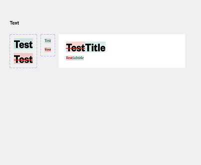
Nebula Design Systems
Nebula is a content management system for online articles. The brands MSNBC, NBC News, Today, and Telemundo use this system. My job was to revise the Figma files to create component systems, add auto-layout and constraints to all elements, write design specifications, and create flows to show the engineering team how features worked.
Component Systems
Here's an example of a component system for a complex modal that shows edit history. Some of the elements like buttons are part of a higher level component system, so they're not part of this local system for the History modal.


UI Specifications
Here's an example of how I wrote UI specifications. This is for an article row.

Flows
Here's an example of how I showed flows to the engineering team.

TODAY Game
Today is a lifestyle-based news brand, and it tends to focus more on brighter events. The TODAY product team wanted to make a casual game for the website, but they didn't know where to start. My job was to do the initial ideation for the game.
You can check out the game here (it does require an account): https://www.today.com/games
Definining Casual Games
I made sure I understood the definition of casual games. They are:
-
Targeted towards the masses
-
For people who play games as a small hobby
-
Involve simpler rules, shorter game sessions, and are easy to play
Understanding the Genres
I looked up all potential genres of casual games. These were puzzle, simulation, action, adventure, word, trivia, card, board, and hidden object games. I also made sure I understood the definitions of each genre, and I researched some of the popular games in-depth to understand their successes.

Understanding Constraints
The main constraint was that the game had to be self-operating and automated, meaning no human labor would be needed. I created a pros/cons table while considering this constraint.

Features of Good Casual Games
Considering my competitive analysis research and the constraints, I created a list of features. The game should:
-
have simple actions
-
have clear and easy-to-understand graphics and UI
-
be easy to learn without instructions
-
have the ability to share results on social media platforms or over text
-
have challenges so that people feel accomplished when winning
-
have games or levels can be completed in minimal time
Initial Ideation
I presented all of my findings to the team, and we ideated a list of potential games. Then, my project manager conducted feasibility analyses on all the games and asked me to created wireframes for 15 different potential games. The main categories were word games, guessing games, trivia recipe games, and sorting games.
Word
Here's one out of four word games I created. This is essentially a word search, and you have to find all the words of an article headline. Once you find the words, the game is finished, and you get a link to the actual article. This game ended up being the basis for the final iteration, and it was actually my idea!

Identify
Here's one out of three guessing games that I created. Essentially, you're given a pixelated image, and you have to decide which headline goes with the image. You're given a couple chances, and the image gets less pixelated with each try. At the end of the game, you get a link to the article.

Recipe
Here's one of the two recipe games I created. TODAY has a recipe article section, and this game pulls three of those recipes for the game. Essentially, you're given ingredients from all three recipes, and you have to sort them correctly into the venn diagram.

Pricing
Here's one of the four recipe games I created. TODAY has a section where they market various products in article format, and this game pulls products from a single article. Essentially, you're given the products, and you have to sort them by lowest to highest price. At the end, you're given links to the products.

Final
After this, I handed my designs off to user researchers so they could test the games. Then, other designers continued the project. Ultimately, the final game was the word search where you find words to create a headline.
You can check out the game here (it does require an account): https://www.today.com/games


Elections Data Visualizations
The elections team had a visualization to represent how people voted by type. My job was to take the old version of the visualization and make it easier to understand without changing the structure too much. I also had to represent the same information.
Original Desktop Version
This is essentially showing how votes are cast.

Revised Desktop Version
In the old version, the use of the bubble chart seemed ineffective. First of all, some of the bubbles were too small to see. Also, it didn't feel necessary to have a visualization for every single data point, especially since the percentages were written out. So, I focused on a high level data visualization where the overall votes were compared to each other in a pie chart. A pie chart made the most sense because the data was showing a percentage out of 100, and there were only three categories to compare. I made sure to research data visualizations to find the best one for this circumstance.
To help with comprehension, I also added white space between the data rows, line dividers, and visualizations for all the candidates (these are placeholder candidates to be clear).

Mobile Versions
I added the same edits to the mobile version. However, I also noticed that in the original mobile version, the information is extremely cramped and condensed. So, in my revised version, I also added a tab system so that the information had more breathing room.
Original

Revised
.png)
Reflection
Ultimately, through this internship I learned how to work with large design systems than span multiple brands. I also learned how to be creative under business constraints and collaborate across multiple teams. It was an amazing experience overall!